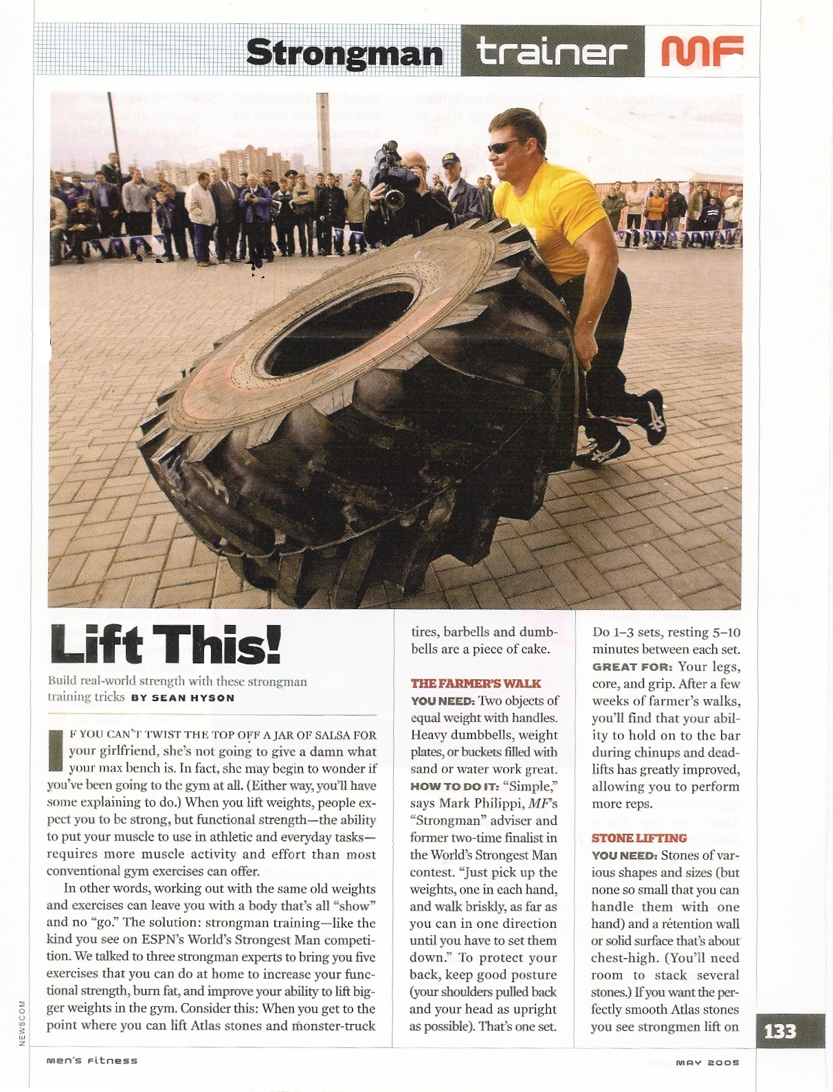
This portion of a magazine shows how I could incorporate large pictures or other media into my article while still maintaining a professional format.
Another good thing about it is the layout of the article, they use proper spacing and technique in an easy to read format thats not to straining on the eyes.
The line across the top is a good way of show what the article is about without depending to heavily on the title and picture.

One good thing about this example is its straight forward guide of navigation, Information is easy to find and stands out on the page.
Another is the use of fonts, by using a mixture of font size, color and weight, information doesnt blend together and enough uniformity is used to know what kind of text means what
One other good thing about this is the use of pictures. by using pictures someone reading could see what he or she wants to read and navigate to the correct page with little hassle.
In my digital, flash-based magazine i will use all the standards of publishing, but putting it into a more modern medium of the internet including videos and pictures in a simple navigation. I can use the same or similar layout and design as shown in the above examples to achieve a professional appearance in my magazine for the web.
Thursday, November 13, 2008
0 comments:
Post a Comment